A home office has two jobs: support focused work and not make you miserable. Most home offices fail at one or both — either functional to the point of sterile, or atmospheric but chaotic.
Getting the decor right in a home office isn’t about aesthetics for their own sake. It’s about creating an environment where you can do your best work and, increasingly, present yourself well on camera. Both of these goals have practical implications for how you approach the space.
Start With Function, Then Layer In Personality
The single most common home office decorating mistake is prioritizing aesthetics before function. A beautiful desk with insufficient storage creates a cluttered mess within a week. A stunning wallpaper accent wall doesn’t help if the lighting gives you headaches by noon.
Establish the functional foundation first:
- Adequate surface area for the actual work you do
- Proper ergonomic setup (monitor height, chair support)
- Good task lighting that doesn’t cause glare on the screen
- Storage sufficient for what you actually store
Once those elements are in place, the decorating work begins on top of them.
Color: The Foundation of Office Atmosphere
Color has a documented effect on mood and focus. For a home office, the goal is a color that supports sustained attention — neither so stimulating it creates anxiety, nor so neutral it’s deadening.
Colors That Work Well
Soft greens and sage: Calming without being boring. Associated with nature and growth. Work well in both warm and cool light. Sage green and muted olive tones have become popular in home offices for good reason.
Warm whites and cream: Clean and calming. Make a space feel larger and more open. The key is avoiding bright, cold white — opt for whites with yellow or pink undertones (warm whites) rather than blue undertones (cool whites).
Warm grays and greige: Neutral without being sterile. A good choice when the room gets mixed natural and artificial light throughout the day.
Dusty blue: Calming and focused. Works particularly well in rooms with warmer wood tones, which balance its cooler quality.
Colors to Use Carefully
Bright, saturated colors — red, orange, bright yellow — increase energy and short-term alertness but can cause fatigue in sustained work environments. Use them in accents (a throw pillow, a single chair) rather than as wall colors.
Very dark walls (navy, deep charcoal, forest green) can create a dramatic, focused atmosphere but require excellent lighting to prevent the room from feeling cave-like and oppressive. They work best in rooms with generous natural light.
Desk Placement and Background for Video
Video calls have added a layer of consideration to home office setup: what’s visible behind you matters. An attractive, organized background signals competence and professionalism whether or not you consciously intend that signal.
Desk Placement
Face a window when possible. Natural light hitting your face from the front is the best lighting for video calls and the most pleasant for your own eyes during work. Sitting with a window behind you creates glare and silhouette issues.
Face the room, not the wall. Sitting with your back to the door or the room creates a slightly uneasy feeling — the psychological sense of being sneaked up on. Positioning the desk to face the room entrance or at minimum at a 90-degree angle to it creates a more comfortable working orientation.
The Background Zone
What’s visible behind you in a video call is typically a 6 to 8-foot-wide section of wall at seated eye level. This zone is worth thoughtful curation.
What works as a background:
- A well-organized bookshelf with books, a few objects, and some negative space
- A clean wall with one or two pieces of art or framed work
- Plants (large leafy plants add life and visual interest without distraction)
- A gallery wall of framed art (eclectic but organized)
What doesn’t work:
- A messy pile of papers, random boxes, or laundry visible in the background
- A blank white wall with nothing on it (looks unfinished and institutional)
- Very bright windows directly behind you (creates backlight)
The background communicates something about you. Make it deliberate.
Shelving: Storage and Display
Open shelving in a home office serves both storage and decorative functions. When done well, it makes a room look intentional and professional. When done poorly, it looks chaotic.
The Shelf Styling Rule
Every shelf should have a clear organizing principle: all books, a mix of books and objects with clear visual spacing, or a curated collection of a single type of object (plants, ceramics, art books).
Practical formula for a mixed shelf: Group books by height or by color. Leave a third of the shelf for objects and negative space. Vary heights with a mix of horizontal book stacks and vertical arrangements.
For video call backgrounds specifically: Reduce the visual density. A slightly sparse shelf looks better on camera than an overstuffed one — cameras flatten depth and a dense shelf can look chaotic in a way it wouldn’t in person.
Floating vs. Freestanding
Wall-mounted floating shelves are better for small rooms — they preserve floor space and look clean. Freestanding bookcases suit larger rooms and can anchor a wall visually as a background feature.
Lighting: The Most Overlooked Factor
Poor lighting in a home office causes eye strain, headaches, and poor-quality video calls. It’s also one of the cheapest things to fix.
Layer Your Lighting
Task lighting: A desk lamp providing direct, focused light to your work surface. Position it to the side and slightly in front — not behind the screen, which causes glare. Look for lamps with adjustable color temperature so you can shift from cooler light for morning focus work to warmer light for afternoon deep work.
Ambient lighting: Overhead light or floor lamps that light the room generally. This prevents the harsh contrast of a bright screen in a dark room, which causes eye fatigue.
Video call lighting: A simple ring light or a soft light panel positioned at face level in front of you dramatically improves how you appear on video. Even a daylight-balanced desk lamp pointed at your face works.
Bulb Temperature
Use daylight or cool white bulbs (4000K to 5000K) for task lighting — this color temperature supports alertness and focus. Accent lighting and floor lamps can be warmer (2700K to 3000K) to provide contrast and comfort.
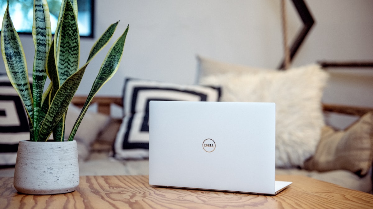
Plants in the Office
Plants in a workspace improve air quality modestly and, more significantly, improve mood and focus according to multiple studies. They also look good on camera.
Best plants for low-maintenance office use:
- Pothos: Nearly indestructible. Trails attractively from a shelf.
- ZZ plant: Thrives in low light, minimal watering.
- Snake plant: Architectural, tolerates low light, very low maintenance.
- Fiddle leaf fig: High maintenance, but striking as a statement plant in a corner if your room has good light.
- Small succulents or cacti: On the desk itself — compact, minimal care.
One large plant in a corner and a small plant on the desk creates the right density without overwhelming the space.
Organizing the Visible Surfaces
Desk surface organization has a direct effect on the ability to focus. Research on environmental psychology consistently shows that visual clutter in the immediate work environment increases cognitive load — the brain processes visual stimuli even when you’re trying not to.
Desk surface principle: Keep only what’s used daily on the desktop. Everything else goes in a drawer, a shelf, or off the desk entirely.
The drawer rule: Your primary desk drawer should be organized, not a dumping ground. If opening the drawer and seeing disorder creates a small twinge of stress, address it.
Cable management: Visible cables are the fastest way to make a tidy desk look messy. A cable management box on the floor behind the desk, cable clips along the desk edge, and cable ties for grouped cords eliminates most visible cable chaos for under $30.
The Final Edit
Once the office is furnished and decorated, stand in the doorway and look at it fresh. Ask two questions:
- Does this look calm and organized, or does it look busy and cluttered?
- Does the background behind the desk chair look intentional and professional?
Anything that makes the answer to either question “no” should be moved, organized, or removed. The goal is a space you want to sit down in every morning — not a space you tolerate.