Japandi became a named aesthetic sometime around 2019 and promptly got ruined by the internet. If you search for it now, you will find a parade of nearly identical images: pale wood floors, a bouquet of dried pampas grass, one ceramic vase, a folded linen throw. The image is not wrong, but it is thin. It describes the surface of a philosophy that runs considerably deeper.
The actual ideas behind Japandi, drawn from Japanese wabi-sabi and Scandinavian hygge, are worth taking seriously. They are not merely aesthetic positions. They describe a relationship with objects, space, and impermanence that shapes not just how a room looks but how it functions and how it feels to inhabit over time.
Where It Comes From
Wabi-sabi is a Japanese aesthetic and philosophical framework that finds beauty in imperfection, impermanence, and incompleteness. The term is difficult to translate cleanly. Wabi, historically associated with rural simplicity and the austere beauty of poverty, describes a kind of rustic understatement. Sabi, associated with the passage of time, describes the beauty that comes with age, wear, and patina.
In practical terms, wabi-sabi is the philosophy that explains why a chipped ceramic bowl can be beautiful, why an uneven hand-plastered wall is preferable to a smooth factory finish, and why an old linen tablecloth with a slight stain from twenty years of family dinners is worth keeping. It is the opposite of pristine.
Hygge is a Danish and Norwegian concept describing a quality of coziness, conviviality, and comfortable togetherness. It is the feeling of warmth and ease that comes from being in a comfortable environment with people you care about. Candles. Soft textures. A cup of something warm. The specific pleasure of small, domestic comfort.
Hygge is often sentimentalized into a lifestyle marketing category. But at its core, it describes something real: the way physical environment affects psychological comfort, and the deliberate creation of that comfort through modest, sensory means.
Japandi sits where these two ideas overlap. From Japanese design it borrows restraint, precision, the appreciation of natural materials in their honest state, and a comfort with emptiness. From Scandinavian design it borrows warmth, the centrality of comfort, and the principle that functional objects should also be beautiful.
What results is an aesthetic that is simultaneously more minimal than Scandinavian and warmer than pure Japanese modernism. It is, in practice, one of the most livable design philosophies available.
Core Principles
Restraint Over Minimalism
Japandi is often called minimalist, but this misses something important. Minimalism, in its design-world definition, pursues reduction for its own sake. It can be cold. It can feel like a performance of absence.
Japandi is not about owning less as an end in itself. It is about being deliberate about what you own and ensuring that what remains is genuinely useful, genuinely beautiful, or preferably both. The principle is closer to the Japanese concept of ma, or negative space that carries meaning, than to minimalist reduction.
The practical difference: a minimalist room might remove objects to achieve a particular visual effect. A Japandi room has fewer objects because every object that remains has been considered and chosen. The result may look similar from a photograph, but it feels different to inhabit.
Natural Materials in Honest Form
Both Japanese and Scandinavian design traditions prize natural materials, but the specific approach is important. Materials should appear close to their natural state. This does not mean unfinished or crude. It means that an oak tabletop should look like oak, with its grain, its slight variation, its inherent character. Not like a manufactured product that mimics oak.
Preferred materials in Japandi interiors:
- Light wood: White oak, ash, bamboo, and birch dominate. Dark woods are less common in true Japandi than the Pinterest version suggests. The preference is for woods that are pale, warm, and grained.
- Natural stone: Marble, granite, and particularly rough or honed finishes rather than polished. Imperfection is valued.
- Ceramics: Thrown pottery with slightly irregular forms. A commercially perfect, factory-made vase reads as out of place.
- Linen and cotton: Natural fiber textiles in undyed or low-saturation colors. No synthetic blends or highly processed fabrics.
- Rattan and seagrass: For small accent pieces. A rattan tray, a seagrass basket. Not entire rooms of wicker.
Color Palette
The Japandi palette is warm and restrained. It is not cool grey or stark white. It is not deep navy or forest green (which belong to other Scandinavian-influenced aesthetics).
| Color Category | Japandi Palette |
|---|---|
| Neutrals | Warm greige, off-white, clay, putty, oatmeal |
| Earthy tones | Terracotta, dusty rose, sage, muted ochre |
| Dark accents | Charcoal, deep forest green, ink black |
| Wood tones | Pale oak, natural ash, warm birch |
| Avoid | Cool grey, bright white, jewel tones, navy |
The palette should feel like it came out of the ground. Like something that existed before anyone decided to manufacture a color. This is not an accident. Both Japanese and Scandinavian traditions are fundamentally connected to landscape, season, and the natural cycle.
Craftsmanship and Visible Making
Both traditions value things that show evidence of being made by hand. Japandi interiors tend to include:
- Thrown or hand-built ceramics
- Furniture with visible joinery
- Fabrics with texture rather than machine-perfect uniformity
- Objects that age visibly and well
The machine-made perfect object, however expensive, does not belong in a Japandi interior unless it is genuinely functional and otherwise invisible. A well-designed Japanese rice cooker can sit on a kitchen counter because it is functional and considered. A decorative object that is factory-perfect and perfectly symmetrical has no warmth and does not belong on the shelf.
Comfort Is Not Optional
This is where Japandi diverges from Japanese minimalism, which can be spatially austere in ways that are not always physically comfortable. Hygge insists on comfort as a non-negotiable. A room should feel good to be in. The sofa should be inviting. The textures should be pleasant to touch.
This means that a Japandi interior should have:
- Seating that is genuinely comfortable, not merely visually correct
- Sufficient textile layers (throws, cushions, rugs) to create warmth underfoot and to the touch
- Lighting that is warm and adjustable
- Objects that relate to sensory pleasure (a good candle, a plant, a ceramic cup worth holding)
Materials Guide
| Material | Role | Notes |
|---|---|---|
| White oak | Primary furniture wood | Oil or hardwax finish preferred |
| Linen | Curtains, bedding, throws | Undyed or low-saturation |
| Natural cotton | Upholstery, cushion covers | Textured weaves preferred |
| Hand-thrown ceramics | Vases, bowls, cups | Imperfect is correct |
| Jute / sisal | Rugs, baskets | Natural over synthetic |
| Washi paper | Lampshades, screens | Traditional Japanese material |
| Bamboo | Trays, accessories, occasionally furniture | Sustainable choice |
| Natural stone | Countertops, side tables, honed or matte | Not polished white marble |
| Rattan | Accent only, not as a dominant material |
Room-by-Room Application
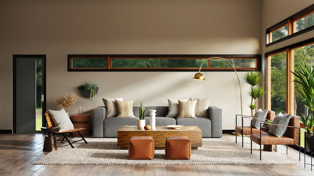
Living Room
The living room is where Japandi is most legible as a design language. The principles in practice:
Furniture: A low sofa with a simple silhouette in a natural linen or cotton. Low-profile coffee table in oak or stone. A single accent chair, perhaps in a complementary material. The furniture should not touch the walls. Space around furniture is not wasted space. It is intentional. This is ma in practice.
Textiles: One good rug (wool, jute, or cotton), layered cushions in two or three complementary textures, a throw folded on the sofa. Do not chase maximum softness. A linen cushion and a wool cushion together are more interesting than four identical velvet cushions.
Objects: One or two considered objects on a surface. A handmade ceramic bowl. A single branch in a simple vessel. An interesting stone. Resist the impulse to fill shelves. An empty shelf is not a failed shelf.
Lighting: Warm, layered. A paper or textile pendant. A floor lamp or table lamp for task and accent. No recessed downlights if possible (they read as too clinical). If you have recessed lights, supplement them with warm lamp light and dim them significantly in the evening.
Bedroom
The bedroom is where Japandi’s Japanese influence is strongest. The bedroom in traditional Japanese interiors was spare, clean, and oriented toward rest.
The bed: A low platform bed or a simple bedframe in pale wood. High, elaborate headboards are inconsistent with the aesthetic. Natural linen or cotton bedding in white, off-white, or very muted color. No busy patterns.
Storage: Japandi bedrooms address storage honestly. Either hide it completely (built-ins, closed storage) or make it part of the composition. An open shelf with three considered objects and neatly folded textiles is intentional. An open shelf with accumulated objects is not.
Nightstands: Simple. One material, simple form. A wall-mounted swing arm lamp rather than a table lamp saves surface space and looks cleaner.
Kitchen
Japandi kitchens emphasize material and function over decoration.
Cabinetry: Flat fronts in pale wood veneer, natural oak, or painted in warm putty or greige. No elaborate hardware. Simple bar pulls or push-to-open mechanisms. The cabinetry should recede, not announce itself.
Countertops: Honed marble, stone, or sealed concrete. Polished black granite and glossy white quartz are not right for this aesthetic. Honed surfaces show imperfection and absorb light rather than reflecting it.
Open shelving: If used, keep it sparse. A few ceramic pieces, a plant, functional items stored beautifully. Every item on an open shelf is a conscious choice.
Workspace
The Japandi workspace is organized, spare, and oriented toward focus. Only what is needed for work should be visible. Materials should be natural where possible: a wooden desk, a ceramic pen holder, a natural fiber desk mat.
Clutter is the enemy of both Japanese and Scandinavian workspace aesthetics. This is not merely visual. It is cognitive. A workspace with fewer objects present is easier to focus in.
What Japandi Is Not
The aesthetic has attracted a certain kind of over-literal interpretation that misses the point.
It is not beige. The palette is warm, but it should have depth and variation. A room painted entirely in greige with greige furniture and a greige rug is monochrome, not Japandi.
It is not just dried pampas grass and empty vases. The objects in a Japandi interior should be genuinely considered. Trend-chasing dried botanicals purchased from a discount home goods store and an Amazon vase do not constitute a Japandi interior. They constitute a trend response.
It is not minimalism with plants. Plants are common in Japandi interiors because they are living, growing, and impermanent. They age. They change with the season. This is consistent with wabi-sabi. But plants that are purely decorative and not genuinely cared for do not fit the philosophy.
It is not cheap. This is perhaps the most important point. Japandi-adjacent aesthetics have been aggressively commodified by fast furniture brands selling “Japandi dining sets” in pale wood laminate. The philosophy specifically values quality of material and evidence of making. A fast-furniture approximation of Japandi is a contradiction in terms.
Not Just a Trend
Trends in interior design have a roughly three to seven year cycle. Japandi has lasted longer than that because it is not, at root, a trend. It is a synthesis of two design philosophies that are both centuries old and both deeply grounded in values that have not changed: the appreciation of natural materials, the respect for craftsmanship, the belief that physical environment affects psychological wellbeing.
The question of whether Japandi “is still relevant” is the wrong question. Whether you choose to name it or not, the underlying principles, restraint, quality, natural materials, comfort, and attention to space, are universally applicable and will not become dated.
What will become dated is the specific surface expression: the particular shape of the 2020s ceramic vase, the exact tone of greige that was everywhere in 2023. The principles beneath them will not.
The Bottom Line
Japandi is a design approach drawn from the intersection of Japanese wabi-sabi and Scandinavian hygge. Its principles: choose fewer, better things; use natural materials in honest form; allow space to breathe; insist on comfort; value imperfection and the passage of time.
The practical result is a home that is quiet without being cold, spare without being sterile, and comfortable without being casual. It ages well because the underlying materials age well, and because the philosophy values that aging rather than fighting it.
Apply it thoughtfully rather than literally. The goal is not to replicate images you have seen. The goal is to create a space you will genuinely want to be in, ten years from now, when the Pinterest version of Japandi looks as dated as the farmhouse aesthetic that preceded it.


