Every room has two kinds of space: the space occupied by objects, and the space that is not. Designers call the occupied space positive space and the unoccupied space negative space. Most people, when decorating, think only about the positive space. They ask what should go here, what should go on that wall, what should fill that corner. The negative space is treated as a problem to solve rather than as an element to deploy.
This is exactly backward. Negative space is not the absence of design. It is design. It is the element that allows everything else in a room to be seen, to breathe, and to read at its best.
What Negative Space Actually Is
In two-dimensional art and graphic design, negative space is the space around and between the subjects of an image. The famous Rubin’s vase illusion, where the same image reads as either two faces or a vase depending on whether you see the positive or negative space as the subject, makes this visible. The two readings are equally valid. The negative space is as much a part of the composition as the positive space.
In interior design, the principle is the same. The space around a sofa, the wall above a credenza, the floor area between furniture pieces, the shelf space that has nothing on it: these are all negative space. They are compositional elements. They determine how the objects in the room read.
Consider two arrangements: a bookcase filled entirely with books and objects, and a bookcase with the same books and objects arranged so that roughly a third of the shelf space is empty. In the first arrangement, the books blur together and no single object stands out. In the second, every object has presence. The negative space acts as a frame for each element.
This is why expensive stores look the way they do. The expensive watch is displayed alone on a white surface. The affordable watch shares a vitrine with forty others. The isolation is part of the communication. The same principle applies to your shelves.
Why We Fill Everything
The impulse to fill space is understandable and nearly universal. Empty space feels unfinished. It feels like something is missing. Guests might think you have not finished decorating. The blank wall seems like a planning failure.
These feelings are wrong, but they are powerful. They are also heavily reinforced by content that celebrates abundance: the maximalist shelfie, the gallery wall with every inch covered, the styled vignette with seven objects artfully arranged. These images are visually interesting as photographs. They are often exhausting to live with.
The decorating industry has a financial interest in selling you more objects. This is not a conspiracy; it is just the logic of commerce. The result is that the dominant aesthetic pressure in consumer design is toward more, not less. Resisting this pressure requires a deliberate decision to treat negative space as a resource to be managed rather than a problem to be solved.
The Practical Case for Negative Space
Beyond aesthetics, negative space has functional effects on how a room works.
Visual rest. A room with no negative space is visually fatiguing. Every surface covered, every wall busy, every shelf full: the eyes have nowhere to rest. This creates a low-grade but persistent sense of stimulation that makes rooms difficult to relax in. Negative space gives the eyes somewhere to pause.
Legibility. When too many objects occupy a space, none of them are properly seen. They compete with each other and blur into visual noise. Negative space allows individual objects to be legible. The one ceramic vase on an otherwise empty shelf is seen. The same vase amid seventeen other objects is not.
Spatial perception. Rooms with adequate negative space feel larger. This is partly optical. When surfaces and walls are covered, the eye registers the objects rather than the boundary of the room. When surfaces are cleared and walls have breathing room, the room reads at its actual dimensions.
Maintenance. A room with fewer objects is easier to clean. This is practical and often overlooked. The beautiful object becomes significantly less beautiful when it is dusty and surrounded by other objects that are also dusty.
The Rough Proportions
Designers work with approximate ratios rather than strict rules, but a useful starting framework:
For shelving and bookcases: roughly 60 to 70 percent filled, 30 to 40 percent empty. This does not mean a uniform distribution. You might have one shelf that is densely arranged and another that has only two objects and significant space. The overall proportion matters more than individual shelf density.
For surfaces (console tables, dressers, side tables): one to three objects maximum in a well-composed vignette, with significant clear space around them. A console table with one large object and one small complementary object looks considered. The same table with seven objects of varying sizes looks cluttered.
For walls: single walls can accommodate gallery arrangements or a single large piece. Avoid covering all four walls in a room unless the specific effect is being pursued deliberately (a library, for example). At least one wall in most rooms should have no wall-hung objects, or a single large piece with significant blank space around it.
For floor area: maintain clear pathways that are at minimum 36 inches wide (90 cm), ideally wider. The space between a sofa and a coffee table should be at least 16 inches (40 cm). The space around furniture should not feel squeezed.
Room-by-Room Application
Living Room
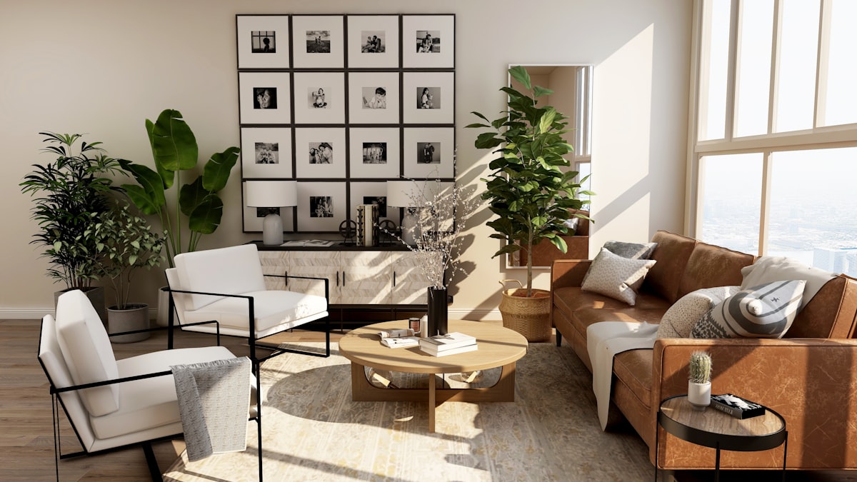
The living room is where negative space does the most work and faces the most resistance. Living rooms accumulate objects. They are shared family spaces where people’s possessions and desires converge.
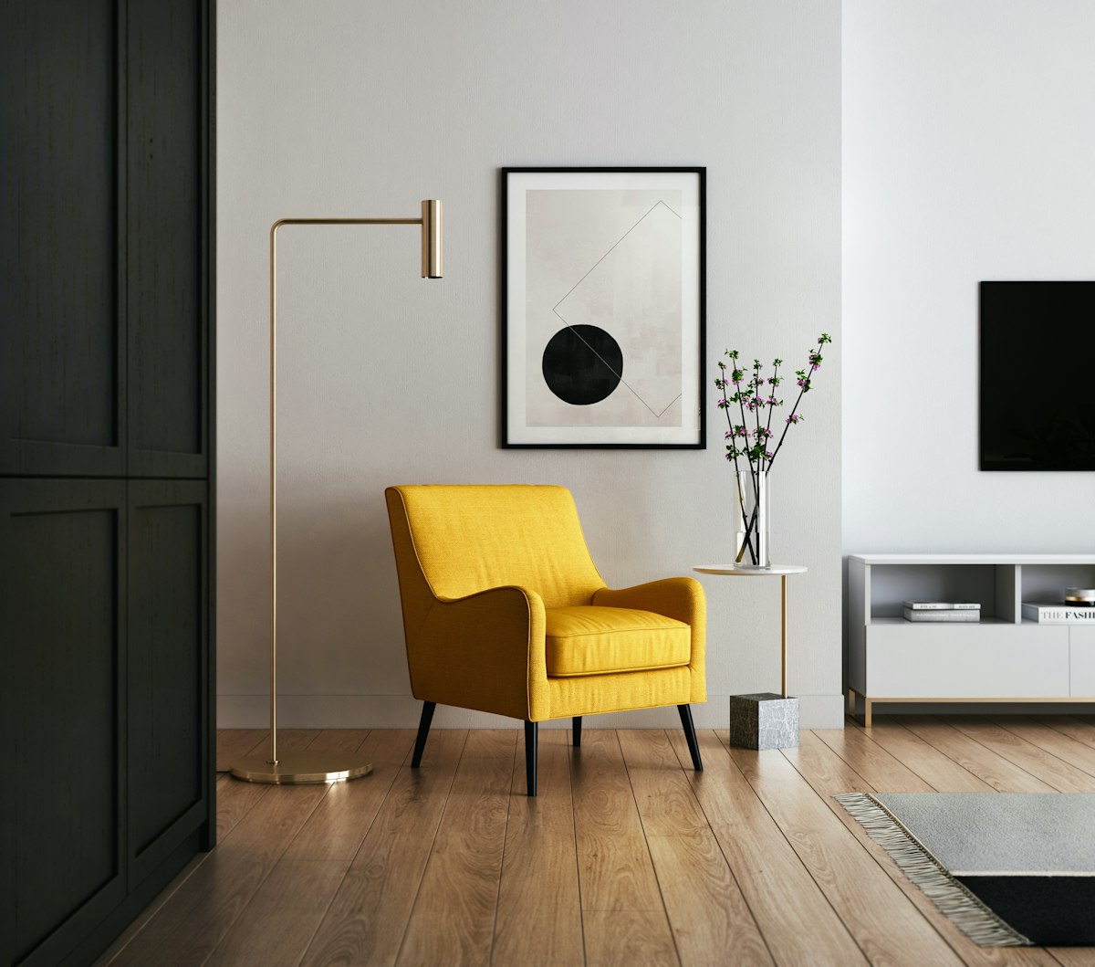
Start with the sofa wall. This is the most viewed wall in most living rooms. Consider what it actually needs. A sofa. Perhaps a coffee table or low credenza in front of it. And probably nothing else on the wall itself, or one large piece of art hung centered and low enough to relate to the furniture below it.
The impulse is to add side tables, fill the wall with a gallery, stack the coffee table. Resist. Give each element room. A sofa with a well-chosen rug, a coffee table with one or two objects, and a clean wall creates more visual impact than the same elements plus eight additional decisions.
Corners. The most common mistake in living rooms is filling every corner. Corner seating, corner shelves, corner plants, corner floor lamps. Most rooms do not benefit from corner furniture at all. An empty corner is not a failed corner. It is space that allows the room to breathe. One considered floor lamp or a single large plant in a corner is sufficient for most rooms.
Bedroom
Bedrooms are the easiest room to get negative space right because the function naturally limits objects. You need a bed, storage, and sleeping-related items. You do not need much else.
Nightstand discipline. Most nightstands have too many things on them. A lamp. A book. A glass of water. A phone. A notebook. A candle. Two of these objects are needed (lamp, whatever you are currently reading). The others are noise. Clear the nightstand to three objects maximum and the bedroom immediately feels calmer.
Dresser tops. A dresser is a functional piece of storage that also becomes a surface for accumulation. One or two objects on the dresser top are fine. A tray to contain small items (jewelry, watch) keeps them organized and limits spread. Everything else goes in a drawer.
The wall behind the bed. A headboard or a single large piece of art above a simple bed creates a focal point with significant negative space on either side. Two symmetrically placed objects flanking the bed is a classic arrangement that works. More than this tips toward busy.
Kitchen
Kitchen negative space is largely about countertop management.
The appliance question. Kitchen countertops in most homes are colonized by appliances: coffee maker, toaster, electric kettle, stand mixer, air fryer. Each appliance makes a case for permanent counter residency. The aggregate result is that no counter space remains for actual food preparation.
A more useful principle: only appliances used daily earn permanent counter space. An espresso machine or coffee maker used every morning stays. A stand mixer used monthly goes in a cabinet. Applying this consistently typically frees significant counter surface.
The visual benefit of a clear counter is proportional to how much of it is clear. Half a clear counter still reads as slightly cluttered. A fully clear counter, with only the daily-use appliances and one considered object (a plant, a piece of fruit in a bowl), reads as calm and spacious. The effort required to get from half-clear to fully clear is modest. The visual effect is substantial.
Dining Room
The dining table is the negative space challenge in the dining room. Tables attract centerpieces, candles, objects placed “just for now” that become permanent. When the table is in use for dining, all objects need to move. When it is not in use, it becomes a landing zone.
The most useful dining table arrangement: a single considered centerpiece (one ceramic, one plant, one sculptural object) or nothing at all. A bare dining table with good chairs is a complete composition. The meal is the event; the table does not need pre-decoration.
The sideboard or buffet. If you have one, apply the 30 to 40 percent negative space rule. The eye needs somewhere to land that is not occupied. One or two larger objects (lamps, significant ceramics, a plant) with clear space between them and around them. No gallery of small objects.
Workspace
Workspace negative space directly affects cognitive performance rather than merely aesthetic experience. Cluttered desks have been shown to increase cognitive load and reduce focus. The case for negative space in a workspace is functional as well as visual.
The desk surface: what you are currently working on, a lamp, and a cup for pens or tools. Everything else should be stored or removed. A laptop, a notebook, a lamp. This is the desk. Not the desk plus twelve other things that might be needed.
The wall in view while working: blank, or with one piece of art. Avoid putting a pin board, a calendar, a whiteboard, and a wall organizer all in the direct line of sight. One functional element (a pin board if needed, a whiteboard if needed) is the limit.
How to Resist Filling Every Corner
This is the actual challenge. Knowing the principle and applying it are different things.
The waiting approach. When a surface or wall is empty and you feel the impulse to fill it, wait. Live with the empty space for two weeks. At the end of two weeks, if you still feel something is missing, it probably is. More often, you will have adjusted to the negative space and recognized that it is an asset.
The subtraction edit. Rather than asking what to add to a room, ask what to remove. Take one object off every surface in a room and assess the result. This is almost always an improvement. Continue until removing an object would create a visible gap rather than a welcome breath.
The tray method. For surfaces that attract accumulation (bedside tables, console tables, entry surfaces), use a tray. Everything within the tray is considered in-scope. Everything outside the tray is out of place. The tray creates a defined boundary that limits spread.
Photographing the room. Looking at a photograph of a room reveals its composition in a way that inhabiting it does not. Photograph your spaces and look at them as images. The areas that feel busy in the photograph are busy. Trust the photograph.
The Bottom Line
Negative space is not empty. It is the compositional element that makes everything else in a room readable, restful, and considered. The impulse to fill it is nearly universal and almost always worth resisting.
Apply rough proportions: 30 to 40 percent of any shelf or surface should be unoccupied. Give furniture breathing room. Limit objects on any given surface to one to three. Leave at least one wall in most rooms free of wall-hung objects.
The reward for getting this right is a home that is visually calm, spatially generous, and in which every object you choose to keep is actually seen and appreciated. That is the point of having things worth keeping.