The Real Problem with Most Living Rooms
The single biggest layout mistake is prioritizing how furniture looks over how people move. If walking from the kitchen to the hallway requires sidestepping a coffee table, the layout has failed. A living room exists to be lived in. That means clear traffic paths, comfortable conversation distances, and furniture that fits the room’s actual dimensions.
The fix starts with three numbers: 30 inches for walkways, 14 to 18 inches between sofa and coffee table, and 8 to 10 feet between conversation seats. Memorize those. They solve about 80% of layout problems before they start.
This guide covers how to measure a room properly, choose from three proven layout archetypes, scale furniture to the space, and avoid the mistakes we see repeated in almost every home we review.
Measuring Your Space the Right Way
Before moving a single piece of furniture, we need an accurate floor plan. Not a CAD drawing. A simple sketch on graph paper works perfectly.
Step 1: Measure every wall. Walk the perimeter of the room with a tape measure. Record each wall length. Include alcoves, bump-outs, and angled walls.
Step 2: Mark fixed elements. Windows, doors, radiators, electrical outlets, HVAC vents, and light switches cannot move. Plot them on the sketch with rough measurements from the nearest corner. These are constraints, not suggestions.
Step 3: Trace traffic patterns. Draw lines showing how people naturally walk through the space. The path from the front door to the kitchen. The route from the hallway to the bathroom. These paths must stay clear. Placing furniture across a traffic line creates that awkward sidestep problem.
Step 4: Test with painter’s tape. This is the most underused trick in home design. Tape the outline of any new furniture directly onto the floor at full scale. An 84-inch (213 cm) sofa sounds fine in theory. Seeing its actual footprint on the floor, right next to the balcony door it partially blocks, tells a completely different story.
A 10-minute taping session prevents a $1,200 mistake. We recommend it for every piece larger than an accent chair.
Three Layout Archetypes That Work
Most living rooms fall into one of three functional categories. Pick the one that matches how the room actually gets used, not how it looks on Pinterest.
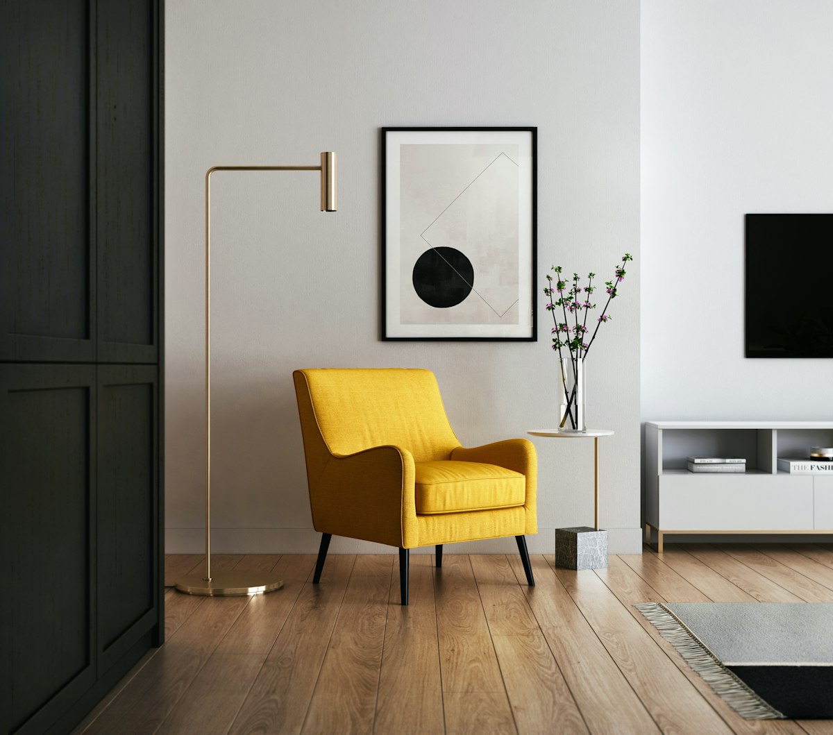
1. The Conversational Layout
Best for: Entertaining, reading, rooms where the TV is not the focus.
This layout places seating in a roughly squared-off arrangement. A sofa opposite two armchairs, or two loveseats facing each other. The goal is face-to-face interaction.
The critical distance is 8 to 10 feet (2.4 to 3 meters) between seats. Beyond that, people have to raise their voices to hold a normal conversation. The room starts to feel like a waiting area rather than a gathering space.
A coffee table or ottoman anchors the center. Keep it within 14 to 18 inches (35 to 45 cm) of the nearest seat so drinks and books are reachable without leaning forward awkwardly.
This layout works well in formal living rooms, libraries, and any space where conversation is the primary activity. Budget roughly $1,200 for a mid-range sofa and $300 to $500 per accent chair.
2. The TV-Centric Layout
Best for: Daily relaxation, movie nights, family rooms.
The television dictates seat orientation, but it does not have to dictate everything. The most common mistake here is pushing the sofa against the wall opposite the TV, creating a long, narrow canyon.
Pull the sofa forward by at least 12 inches (30 cm). This simple move closes the viewing distance, creates a more intimate feel, and opens up space behind the sofa for a console table or narrow bookshelf.
Optimal viewing distance for a 65-inch (165 cm) TV is roughly 8 to 10 feet (2.4 to 3 meters). For a 55-inch (140 cm) screen, aim for 7 to 9 feet (2.1 to 2.7 meters). These numbers come from the Society of Motion Picture and Television Engineers (SMPTE) recommendations for a 30-degree viewing angle.
Add a side chair or two at an angle to the sofa. They create secondary seating that works for both TV watching and conversation when guests are over.
3. The Open-Plan Layout
Best for: Apartments, studios, open-concept homes where the living room shares space with the kitchen or dining area.
Here, furniture defines rooms that walls do not. The sofa becomes a partition. An area rug becomes a boundary.
Use the sofa’s back as a visual divider. Place it with its back facing the dining area or kitchen. This creates a clear “living room” zone without blocking sightlines or natural light. A low console table behind the sofa reinforces the division and provides a landing surface for the dining side.
Area rugs are essential in open plans. A 5 x 8 foot (152 x 244 cm) or 8 x 10 foot (244 x 305 cm) rug under the seating group anchors the living zone. Leaving the adjacent dining area on bare floor, or using a different rug texture, signals a separate function.
The biggest open-plan trap is using too many small furniture pieces. Fewer, larger items read as more intentional and reduce visual clutter. A single substantial sofa is better than a sofa plus loveseat plus two chairs all crammed together.
Furniture Sizing Guide
Scale is the difference between a room that feels designed and one that feels stuffed. Oversized furniture in a small room is the fastest path to a cramped, uncomfortable space. Undersized furniture in a large room looks like dollhouse pieces.
| Furniture Piece | Standard Depth/Width | Recommended Clearance |
|---|---|---|
| Sofa (Standard) | 84 to 96 inches (213 to 244 cm) wide, 34 to 40 inches (86 to 101 cm) deep | 30 to 36 inches (76 to 91 cm) walking path |
| Sofa (Apartment) | 60 to 72 inches (152 to 183 cm) wide | Same clearance applies |
| Coffee Table | 48 to 54 inches (122 to 137 cm) long, 18 to 24 inches (45 to 60 cm) deep | 14 to 18 inches (35 to 45 cm) from sofa |
| Accent Chair | 28 to 32 inches (71 to 81 cm) wide | 36 inches (91 cm) between chairs |
| Console Table | 48 to 60 inches (122 to 152 cm) long, 12 to 16 inches (30 to 40 cm) deep | 30 inches (76 cm) clearance in front |
| End Table | 18 to 24 inches (45 to 60 cm) square | Same height as sofa arm (± 2 inches) |
The sofa arm height rule matters more than people think. An end table that sits 4 inches higher or lower than the sofa arm looks wrong and makes it awkward to set down a drink. Match the heights within 2 inches (5 cm).
The coffee table length rule is equally important. A coffee table that is less than half the length of the sofa looks like an afterthought. Aim for roughly two-thirds the sofa length. For an 84-inch sofa, a 48 to 54-inch coffee table hits the right proportion.
The Five Layout Mistakes We See Constantly
Mistake 1: Everything Against the Walls
Pushing every piece of furniture against the walls leaves a dead zone in the center of the room. It feels like a high school dance. Pull the sofa forward. Float the chairs. Use the center of the room as the gathering point, not the perimeter.
In rooms under 150 square feet (14 square meters), wall-hugging is sometimes necessary. For anything larger, float the furniture.
Mistake 2: The Unreachable Coffee Table
If reaching a drink requires an uncomfortable lean, the coffee table is too far from the sofa. The 14 to 18-inch (35 to 45 cm) gap is not a suggestion. It is the range where people can comfortably reach without straining. Test it by sitting on the sofa and extending your arm. The table surface should be reachable without lifting your body off the seat.
Mistake 3: Blocking the Traffic Lanes
The shuffle. That sideways squeeze between the sofa and the wall to get from one room to another. If it exists, the layout is broken. Major traffic lanes need 30 inches (76 cm) of clear space. If the room cannot accommodate both a full-size sofa and clear lanes, downsize the sofa. A 72-inch (183 cm) apartment sofa with room to walk around it will always feel better than a 96-inch sectional that blocks the path.
Mistake 4: Ignoring Vertical Balance
A room full of low-profile furniture feels heavy and compressed. The eye needs something tall to create visual height. A floor lamp. A tall bookshelf. A piece of large-scale art hung at the right height. These vertical elements draw the eye upward and make the room feel taller and more spacious.
The ideal mix is a combination of low seating, mid-height tables, and at least one tall element per wall grouping.
Mistake 5: Fighting the Architecture
If the room has a fireplace, that fireplace is the focal point. Do not arrange the furniture to ignore it in favor of a TV mounted on the adjacent wall. Work with the room’s natural focal point first. If a TV must compete with a fireplace, mount the TV above the mantel or use an articulating arm that swings out when needed and tucks flat when not in use.
Windows, built-in shelving, and architectural details all influence the natural orientation of a room. A layout that works with these elements will always feel more cohesive than one that fights them.
Budget Tiers for Furnishing a Layout
Not every room needs a $5,000 budget. But quality matters for the pieces that absorb daily use.
Budget Tier ($500 to $1,000). Focus on getting the sofa right. A solid-frame sofa with performance fabric from brands like IKEA (Friheten at $599) or Article (Sven at $999) provides a dependable anchor. Add lightweight accent chairs and a simple coffee table from secondhand or flat-pack sources.
Mid-Range Tier ($1,500 to $3,000). This is the sweet spot for a complete living room. A quality sofa ($1,000 to $1,500), two accent chairs ($300 to $600 each), a coffee table ($200 to $400), and a floor lamp ($100 to $250). At this level, look for solid wood frames, sinuous spring or webbed suspension, and stain-resistant upholstery.
Premium Tier ($4,000 and up). Investment pieces. A top-grain leather sofa from Room & Board or Restoration Hardware. A solid walnut coffee table. Heirloom-quality chairs. These are pieces that improve with age and last 15 to 20 years.
The Layout Test
After arranging the room, sit in every seat. Walk every path. Watch TV from the primary viewing position. Have a conversation with someone across the room.
If any of those activities feels awkward, the layout needs adjustment. A room that photographs well but feels uncomfortable to sit in has not succeeded. Trust your body over the floor plan. Comfort beats aesthetics every time in a room that gets used daily.
The best living room layout is the one that disappears. People do not notice it. They just sit down, relax, and live.