A fireplace mantel is one of the most prominent horizontal surfaces in a living room — and one of the most difficult to style well. Get it wrong and it looks like a shelf at a flea market or, worse, a completely ignored ledge collecting dust. Get it right and it anchors the entire room.
The challenge is that a mantel is wide, often shallow, and sits at eye level. Every object on it is on display. You can’t hide poor decisions here the way you can on a bookshelf.
What follows is a practical approach to mantel styling that works across fireplace styles — traditional wood mantels, modern stone surrounds, and brick hearths alike.
Start with Proportions
Before placing a single object, understand what you’re working with.
Measure the mantel width. Standard mantels run 48–60 inches wide; larger ones reach 72 inches or more. The depth is typically shallow — 6–8 inches — which means layering objects front-to-back isn’t really an option. Everything has to coexist at roughly the same depth.
Measure the height above the mantel. The wall space above the mantel is part of the composition. Whether you’re hanging art, a mirror, or leaving it bare, that vertical space dramatically affects how the mantel reads.
Identify the ceiling height. In rooms with 8-foot ceilings, a mantel display should be relatively restrained — there isn’t much vertical room. In rooms with 10-foot or higher ceilings, you have more latitude to go taller with art or mirrors.
The Mirror or Art Question
The single biggest styling decision for a mantel is what, if anything, goes above it. Most mantels benefit from one of three approaches:
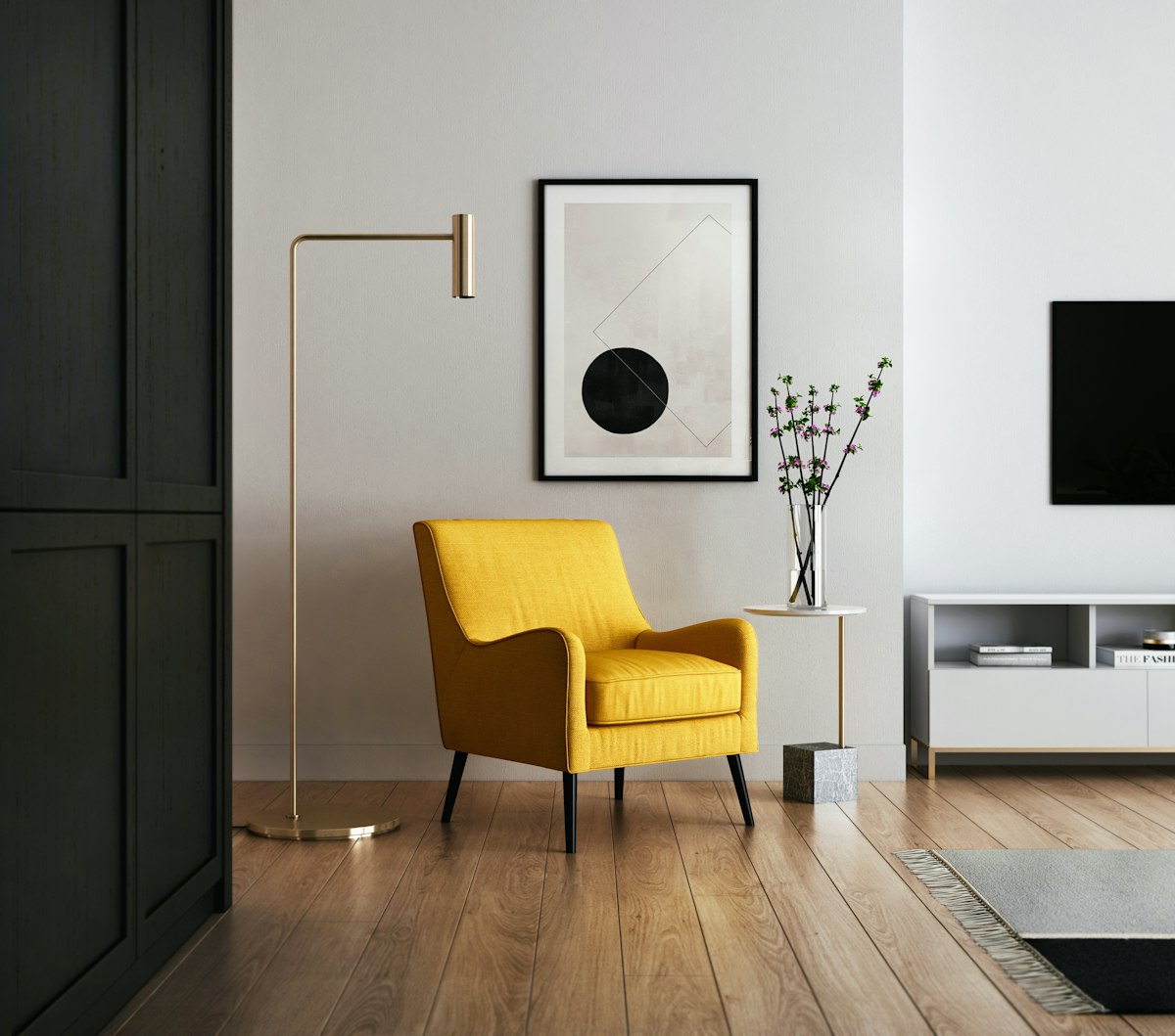
A large mirror: A mirror above the mantel reflects light, makes the room feel larger, and creates a natural focal point. The mirror should be scaled to the mantel — ideally 70–80% of the mantel width. A too-small mirror floating above a wide mantel looks lost. Lean the mirror against the wall instead of hanging it if you want a more casual, layered look.
A single large piece of art: One oversized painting or print anchored above the mantel reads as intentional and creates a strong focal point. The artwork should be wide enough to relate to the mantel — at least half the mantel’s width, ideally more. Anything smaller will look like it got accidentally placed there.
A grid arrangement: Three to five smaller pieces arranged in a tight grid or informal cluster can work above a wide mantel. The key is keeping consistent spacing (2–3 inches between pieces) and treating the grouping as a single unit rather than scattered objects.
Leaving the wall above completely bare can work in minimal or modern spaces, but it requires the mantel objects themselves to carry more visual weight.
The Core Composition Approach
There are two compositional approaches to mantels: symmetrical and asymmetrical. Both work. Mixing them doesn’t.
Symmetrical
A symmetrical mantel uses matching elements on each side — a pair of candlesticks, identical vases, or matching framed prints flanking a central object. It reads as formal, calm, and ordered. This suits traditional or transitional interiors.
A central object (a large candlestick, a sculpture, a clock, or a stack of books) anchors the middle. Flanking objects mirror each other. Heights should echo each other even if they’re not identical.
Asymmetrical
An asymmetrical arrangement creates visual interest through varied heights, sizes, and textures. The key is balancing visual weight rather than mirroring objects. A tall, heavy object on one end might be balanced by two or three smaller objects clustered on the other.
The rule: the eye should land somewhere and then travel across the mantel. If there’s no focal point — if everything is the same size and height — the eye has nowhere to land.
Object Selection
A good mantel typically has four to six objects. More reads as cluttered; fewer requires each piece to work harder.
Height Variation
Include at least one tall element (18 inches or higher), a mid-height element (10–15 inches), and some low elements (under 8 inches). A mantel with all objects at the same height looks flat and boring regardless of how nice the objects are.
Tall options: Large candlesticks, tall vases, sculptural floor objects leaned against the wall, large branches or dried botanicals in a vase, a tall lantern.
Mid-height options: Framed photos, small framed prints, medium vases, clocks, small sculptures.
Low options: Small candles, stacked books, a small bowl or tray, a small potted plant, a low candle holder.
Texture and Material Variation
Mix hard and soft materials, matte and reflective surfaces. A mantel with only ceramic objects or only metallic objects reads as monotonous. Aim for variety:
- One organic element: dried botanicals, a small plant, a piece of driftwood, a stone
- One reflective element: a glass vase, a metallic candlestick, a mirrored object
- One matte element: a ceramic vase, a wooden object, a linen-bound book
Restraint with Candles
Candles are the default mantel object, and they work well — but they can overtake a composition quickly. Two to four candles of varied heights is the maximum for most mantels. More than that tips from “cozy atmosphere” to “shrine.”
Seasonal Updates
A mantel is one of the best places in a home for seasonal styling because it’s so visible and the update is contained. You don’t need to restyle the whole room — just the mantel.
Spring/summer: Fresh or faux branches, light-colored ceramics, a small plant, glass objects. Remove heavy candlesticks and dark elements.
Fall: Dried botanicals, amber glass, warm wood tones, a small pumpkin or gourd if you’re not opposed to seasonal decor. Amber and warm brass read seasonally without looking kitschy.
Winter/holiday: Evergreen branches (real or faux), white candles, a few metallic elements. Keep it simple — holiday mantels are prone to accumulating too many objects.
Common Mistakes
Too many small objects: Small objects on a wide mantel look like clutter even when they’re carefully chosen. Edit aggressively. If removing an object doesn’t leave a noticeable gap, it probably didn’t need to be there.
Centering everything: An arrangement where every object is centered on the mantel looks stiff. Shift objects slightly left or right of center. Let the composition breathe asymmetrically even in a symmetrical arrangement.
Ignoring the hearth below: The hearth and firebox are part of the composition. A stack of logs, a row of tall pillar candles, a simple log holder, or a set of fire tools all contribute to the overall look. An empty firebox in an unused fireplace is a visual void — fill it intentionally. Stacked birch logs, candles at different heights, or a large sculptural object (a ceramic sphere, a piece of driftwood) work well.
Matching everything: Objects that are too matchy — same color, same material, same brand — look like a display rather than a lived-in room. Some coherence is good; some variety is essential.
Leaving it static for years: A mantel that’s never changed stops being seen. Rotate one or two elements seasonally to keep the eye engaged.
A Simple Starting Formula
If you’re not sure where to start: place a tall mirror or art piece above. On the mantel itself, position one tall object slightly off-center, one medium object on the other side, a small grouping of two or three low objects near one end, and leave some deliberate negative space. Step back. Remove anything that feels like it’s competing rather than contributing.
The goal is a mantel that looks like someone with good taste lives here and occasionally adds something they love — not like someone styled it for a photo and never touched it again.