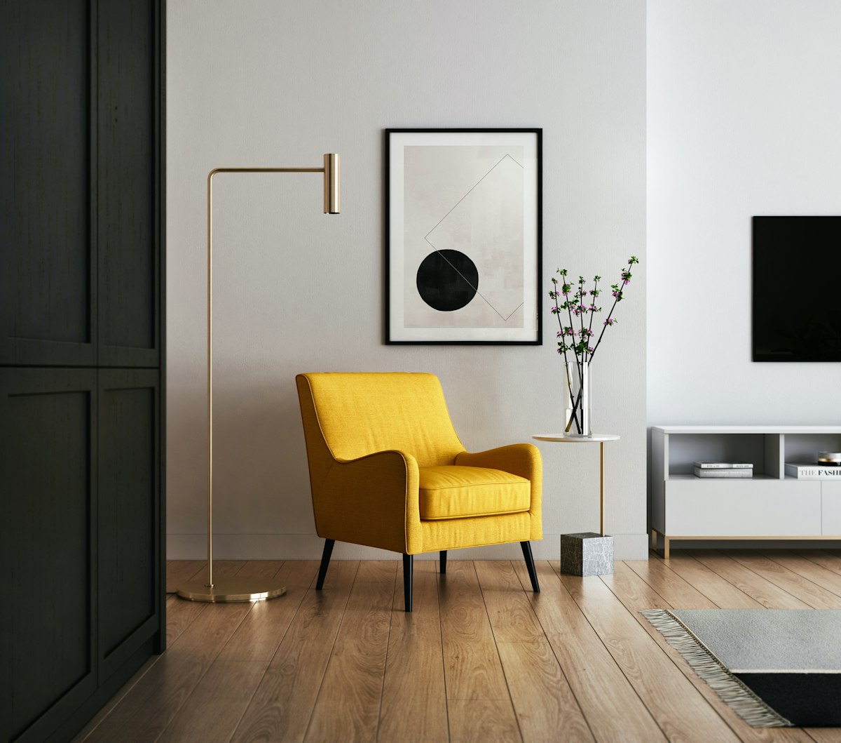
Use the 80/20 rule. Commit 80% of the room to one dominant style and fill the remaining 20% with deliberate contrast pieces. A 50/50 split between two styles creates visual tension that makes a room feel unfinished. An 80/20 split signals intention. The dominant style establishes identity. The accent pieces add character. This is the difference between a room that looks “collected over time” and one that looks like a furniture store clearance aisle.
We studied over 100 professionally styled living rooms and interviewed interior designers to identify the repeatable patterns behind rooms that successfully mix eras, materials, and aesthetics. The principles come down to four variables: scale, color, silhouette, and texture. Master those four and nearly any combination works.
The 80/20 Framework in Practice
The 80% represents the room’s dominant visual language. This is the sofa, the coffee table, the rug, the primary lighting, and the curtains. These pieces establish the “home base” that a visitor reads within the first three seconds of entering the room.
The 20% introduces tension. A single antique chair in a modern room. A sleek, contemporary floor lamp next to a tufted Chesterfield. A rough-hewn reclaimed wood console beneath a minimal, geometric mirror.
The contrast must be sharp enough to read as intentional. A mid-century modern side table next to a transitional sofa barely registers as mixing. It just looks like matching. A carved Victorian accent chair next to that same transitional sofa creates a clear visual statement.
| Room Dominant Style | Effective 20% Contrast | Why It Works |
|---|---|---|
| Mid-century modern | Victorian or Art Deco accent chair | Sharp era contrast, shared emphasis on craftsmanship |
| Scandinavian minimal | Rustic farmhouse wood console | Organic warmth breaks sterile monotony |
| Traditional/classic | Industrial metal and glass side table | Hard materials contrast soft upholstery |
| Industrial loft | Ornate gilded mirror or chandelier | Unexpected elegance adds tension |
| Coastal casual | Mid-century walnut credenza | Structured geometry grounds relaxed palette |
Scale: The Non-Negotiable First Check
Two pieces can come from entirely different centuries and still feel harmonious if they share similar visual weight. Visual weight is the combination of physical size, density, and how much floor space the piece appears to occupy.
A delicate antique side chair next to a massive overstuffed sectional will always look wrong, regardless of color coordination or clever styling. The scale mismatch overwhelms any design intent. The chair looks fragile and lost. The sectional looks bloated.
How to Evaluate Visual Weight
- Density: A solid walnut dresser has more visual weight than an open-frame wire console of the same dimensions. Dense materials read heavier.
- Leg exposure: Pieces raised on visible legs feel lighter than pieces that sit directly on the floor. A sofa on tapered legs has less visual weight than a skirted sofa of the same size.
- Color: Dark finishes read heavier than light finishes. A black lacquer side table carries more visual weight than a white marble side table of identical dimensions.
- Upholstery bulk: Overstuffed cushions add visual mass. Tight, tailored upholstery reads leaner.
Practical Scale Matching
- Seat heights across the conversation group must align within 1 to 2 inches (2.5 to 5 cm). An antique chair with a 16-inch seat height next to a modern sofa with a 19-inch seat height creates an awkward step-down that makes conversation uncomfortable.
- Side table height matches the armrest height of the adjacent seating. A 26-inch (66 cm) mid-century side table works with a modern sofa whose arms sit at 25 inches (64 cm). A 22-inch (56 cm) antique tea table does not.
- Coffee table height sits 1 to 2 inches (2.5 to 5 cm) below the sofa seat cushion. This ratio holds regardless of style era. Too low and guests strain forward. Too high and the table dominates the seating group.
Color: The Universal Bridge
Color overrides style. Two pieces from completely different design traditions will read as a unified composition if they share a coordinated color relationship. This is the most powerful tool for making mixed furniture work.
The Three-Repetition Rule
Repeat any introduced color at least three times across the room. A bold cobalt blue mid-century chair placed in an otherwise neutral, traditional room feels like an accident. That same chair with cobalt reflected in a throw pillow across the room, a stripe in the rug, and the spine of a book on the shelf reads as a deliberate scheme.
Three repetitions tell the eye: this was planned. Two repetitions can still feel coincidental. One is definitely an accident.
Managing Wood Tones
Mixing wood species is not just acceptable. It is preferable. A room where every wood surface matches exactly (all in the same stain, same species, same finish) looks like a furniture store display. The goal is coordinated variety, not rigid matching.
The key is undertone, not species. Wood finishes fall into three undertone categories:
| Undertone | Characteristics | Examples |
|---|---|---|
| Warm | Red, yellow, orange cast | Cherry, mahogany, warm walnut, golden oak |
| Cool | Gray, ashen cast | Cerused oak, gray-washed pine, driftwood finishes |
| Neutral | Brown without strong red or gray | Natural maple, most mid-tone walnuts, teak |
Mix freely within the same undertone family. A warm walnut mid-century credenza pairs beautifully with a warm mahogany antique side table. Both carry orange-red undertones. A warm walnut credenza next to a gray-washed pine bookshelf creates a visual clash because the undertones fight.
Neutral woods bridge between warm and cool, making them the safest accent pieces in any room.
Silhouette: Balancing Lines and Curves
The shape of furniture dictates the room’s visual rhythm. Straight lines create energy and formality. Curves create softness and rest. A room composed entirely of straight lines feels rigid. A room of all curves feels amorphous. The best rooms balance both.
The Contrast Principle
If the dominant 80% is rectilinear, the 20% accent pieces introduce curves. And vice versa.
- Modern minimalist sofa with sharp, square arms? Add a round pedestal coffee table or an arched floor lamp.
- Traditional rolled-arm sofa with curved camelback profile? Anchor it with a rectangular, glass-and-metal coffee table or a straight-legged console.
- A Parsons-style dining table (pure rectangle, no decorative elements)? Pair it with chairs that have curved backs, like the Thonet No. 14 bentwood or an upholstered barrel-back dining chair.
The Leg Test
Look at the legs of every piece in the room. If all legs are the same shape, the room reads as a matched set rather than a collected space.
- Tapered, angled legs (mid-century)
- Turned, ornate legs (traditional)
- Straight, square legs (contemporary/Parsons)
- Hairpin or metal legs (industrial)
- Cabriole legs (French/formal)
A room with three different leg styles, distributed thoughtfully, feels collected. A room where every piece has tapered mid-century legs feels like a catalog page.
Texture: The Secret Unifier
Texture is the most underrated tool for mixing styles. It works on a subconscious level. Two pieces can look completely different in form and era, but if they share a textural relationship, the eye accepts them as belonging together.
Using Textiles to Bridge Eras
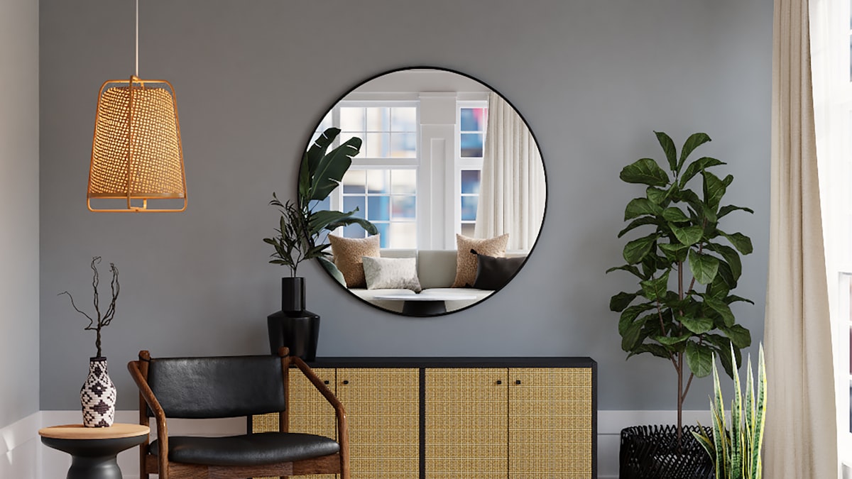
Reupholstering classic frames in modern fabrics is the single most effective style-mixing technique. An ornate Louis XV-style chair upholstered in a crisp geometric print or a solid performance velvet transforms from antique to contemporary instantly. The bones (the carved wood frame) carry historical weight. The fabric carries modern energy. The tension between them creates visual interest.
The reverse works equally well. A highly modern, minimal sofa layered with vintage textiles (a faded Oushak throw pillow, an antique linen blanket, a handwoven kilim lumbar cushion) absorbs historical warmth without losing its contemporary identity.
Material Pairing Guidelines
| Dominant Material | Effective Contrast Material | Effect |
|---|---|---|
| Smooth leather | Rough linen or chunky knit | Tactile tension, cozy warmth |
| Polished metal (chrome, brass) | Raw wood or woven rattan | Industrial meets organic |
| Velvet upholstery | Matte ceramic or unglazed pottery | Rich softness meets earthy restraint |
| Glass surfaces | Warm wood or textured stone | Lightness meets weight |
| Reclaimed wood | Polished marble or lacquer | Rustic meets refined |
Every room needs at least three distinct textures to feel layered and intentional. A room where everything is smooth (leather sofa, glass coffee table, lacquer console, chrome lamp) feels cold regardless of how warm the color palette is. Add a wool throw, a woven basket, or a ceramic vase with a matte glaze and the room softens immediately.
Lighting as a Style Bridge
Lighting fixtures carry enormous stylistic weight relative to their physical size. A single light fixture can shift the perceived era of an entire room.
A modern, geometric chandelier instantly updates a room filled with traditional furniture. The contrast between ornate wood carvings below and clean metallic lines above creates the kind of dynamic tension that defines high-end interior design.
The same principle works in reverse. A traditional crystal chandelier or a vintage industrial pendant in an otherwise modern, minimalist space adds age and gravitas.
Practical Lighting Pairings
- Modern room + traditional fixture: Brass or bronze semi-flush mount with exposed bulbs. Adds warmth without competing with modern furniture lines.
- Traditional room + modern fixture: Linear LED chandelier or a Sputnik-style fixture. Clean geometry lifts the visual weight of heavy furnishings.
- Eclectic room + sculptural fixture: An Isamu Noguchi Akari lantern or a woven rattan pendant. Organic forms serve as a neutral bridge between competing styles.
Art as the Final Statement
Art is the last layer and the most subjective. It provides an opportunity to reinforce the contrast or pull the room together.
Large-scale abstract art in a traditional room signals that the mixing is intentional. It tells visitors that the ornate furniture and the modern sensibility coexist by choice, not by accident. Conversely, classical portraiture or landscape painting in a modern room adds gravitas and historical depth.
Hanging Guidelines
- Frame style can either match the art’s era or the room’s dominant era. Both approaches work.
- In a mixed room, a consistent frame finish across all art pieces (all black, all natural wood, all brass) creates cohesion even when the art itself varies wildly in style.
- Gallery walls work best with a maximum of two frame finishes and a consistent mat width.
The Common Mistakes
- Trying to match eras exactly. An all-mid-century room is not “mixing styles.” It is a period room. Mix across at least two distinct eras.
- The 50/50 split. Two competing styles with equal presence create visual noise, not visual interest. Commit to one dominant.
- Ignoring scale. No amount of clever color work rescues a scale mismatch.
- Matching wood tones exactly. This reads as a furniture set, which is the opposite of collected.
- Introducing too many styles. Two to three styles is interesting. Four or more is chaos. Limit the palette.
The Sequence
For anyone starting from scratch or reworking an existing room:
- Choose the dominant style (80%). Buy or keep the anchor pieces: sofa, rug, primary lighting.
- Select accent pieces (20%). One to three items from a contrasting era or style. An accent chair, a side table, a mirror.
- Check scale. Do the accent pieces share visual weight with the dominant pieces?
- Apply the three-repetition color rule. Pull a color from the accent piece and echo it in textiles, art, or accessories.
- Balance silhouettes. Ensure the room contains both straight lines and curves.
- Layer textures. At least three distinct materials visible from any seated position.
- Step back and edit. If anything looks like an accident, it needs either a repetition to support it or removal from the room.
A well-mixed room does not look “designed.” It looks lived in. That is the goal. Furniture acquired over years, from different sources, unified by someone who understands scale, color, and shape. The 80/20 rule makes that achievable without a design degree.