Start with the largest piece first, centered on the wall. Everything else builds around it. The most common gallery wall mistake is starting from a corner and working outward - the result is a cluster that looks placed, not planned.
A gallery wall fails in one of two ways: too rigid (matching frames, uniform spacing, looks like a product page) or too chaotic (random sizes, clashing tones, competing focal points). The goal is structured improvisation. A cohesive underlying logic that allows for visible personality.
Step 1: Define the Wall and the Boundaries
Before selecting frames or art, define the gallery wall’s edges.
For above a sofa: The arrangement should be 65–75% of the sofa’s width, centered above it. A 200 cm (78 in) sofa calls for a gallery wall 130–150 cm wide. The bottom edge of the lowest frame should sit approximately 20–25 cm (8–10 in) above the sofa back.
For a standalone wall: Define the outer edges first. A common proportion is 150–180 cm wide × 90–120 cm tall for a main focal wall. Marking the outer boundary with painter’s tape before you begin helps prevent creep.
For a staircase wall: The gallery follows the angle of the stairs. Frames are typically arranged in a diagonal line ascending with the staircase, with equal spacing between centers. The challenge is the changing wall height - plan the arrangement on paper first.
Step 2: Collect Your Art and Frames Before Arranging
Gallery walls require visual auditions. Collect more pieces than you plan to use, then edit. This is non-negotiable. Designing a gallery wall from the catalog backward - buying specific items to fill a plan - produces rooms that look designed, not lived-in.
Sources for gallery wall art:
- Personal photography printed at a photo lab (Chatbooks, Artifact Uprising, Framebridge)
- Prints from Etsy sellers (search: vintage botanical print, abstract minimal print, typographic art)
- Art prints from Society6, Minted, or Desenio
- Vintage finds from estate sales, thrift stores, and eBay (the frames are often more character-rich than anything new)
- Children’s drawings, framed - more effective than most people expect
On frame selection: Two approaches work. The first is strict cohesion - all frames in the same finish (all black, all brass, all natural wood). The second is deliberate mixing - a maximum of two frame tones, in proportions roughly 70/30. Three or more frame finishes in equal proportions reads as confusion.
Frame sources worth knowing:
- IKEA RIBBA and HOVSTA - the workhorses. Cheap, consistent, available in multiple sizes.
- IKEA SANNAHED - oval frames for organic variation
- Amazon Basics gallery frames - functional if not exceptional
- Framebridge - higher-end custom framing with mat options
- Thrift stores - for character frames that add visual texture
Step 3: Lay It Out on the Floor
Before anything goes on the wall, arrange the entire gallery on the floor.
The floor layout process:
- Clear a floor area the same size as the target wall space
- Place the largest piece in the center
- Build outward, maintaining consistent gap between frames (5–8 cm is the standard; tighter for small rooms, slightly wider for large walls)
- Step back 2–3 meters and assess - stand at the actual viewing distance
- Photograph the layout from a standing position for reference
Common errors to fix during floor phase:
- Clusters of the same size frames in one area - distribute sizes
- Too many horizontal or vertical frames stacked - alternate orientations
- Same color art concentrated in one zone - distribute dominant colors
- No visual anchor - the arrangement needs at least one piece clearly larger than the others
Step 4: Make Paper Templates
The most important tool in gallery wall installation is not a level - it is kraft paper and painter’s tape.
For each frame in your arrangement:
- Trace the frame outline on kraft paper or newspaper
- Mark the hanging hardware location on the paper (where the nail hole would be)
- Cut out the template
On the wall:
- Tape all templates to the wall with painter’s tape, replicating the floor layout
- Step back and assess - the paper templates read visually very similarly to the finished frames
- Adjust template positions until satisfied
- Mark nail locations through the paper template
- Nail through the paper at each marked point (the paper tears away cleanly afterward)
This process eliminates measurement math, prevents incorrect holes, and allows you to see the complete arrangement before committing. It takes 30–45 minutes and saves two hours of patching and repainting.
Step 5: Hang From the Center Out
With templates placed and nails positioned, hang in this order:
- Center piece first - the anchor point that everything references
- Pieces directly adjacent to center - establish the core cluster
- Top row - work horizontally before moving down
- Outer edges - fill the perimeter last
Leveling: Use a small bubble level on each frame after hanging. Frames naturally rotate slightly when hung. The small adjustment takes seconds. Unleveled frames at the edge of a gallery wall are immediately visible.
Avoid: Hanging all pieces along one horizontal line. A gallery wall with every frame’s center at the same height is a horizontal shelf of frames, not a gallery wall. Vary the vertical position intentionally.
Step 6: Assess at Distance and Adjust
Hang everything, step back to the viewing distance (typically 2.5–3.5 meters for a sofa wall), and assess.
What you’re looking for:
- Is there a clear visual center? The eye should travel to the largest piece first.
- Is the arrangement balanced - not necessarily symmetrical, but visually weighted evenly?
- Does the bottom edge feel grounded? A bottom edge that wanders up and down by more than 10 cm reads as unfinished.
- Does the spacing feel consistent? Wide and narrow gaps in the same arrangement feel unintentional.
The easiest adjustment: Add or remove one small frame. A gallery wall that feels slightly too sparse usually needs one additional piece. One that feels cluttered usually has one piece too many. The edit is always smaller than it feels.
Layout Styles
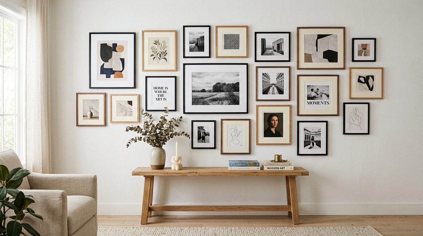
Salon-Style (Classic)
Frames of mixed sizes, mixed orientations, arranged edge-to-edge with consistent spacing in a roughly rectangular overall shape. The most versatile. Works with nearly any aesthetic. Used by art collectors and interior designers as a default because it accommodates any combination of art sizes.
Grid
Same-size frames, identical spacing, arranged in a strict rectangular grid. Very organized. Requires precision during installation - any frame off by 5 mm is immediately visible against the grid. Works best with photography collections, minimalist rooms, or art prints in a consistent series.
Line
A single row of frames, either horizontal or vertical. More curated than a full gallery wall. Works above a narrow wall, a staircase landing, or a hallway. Requires fewer pieces (5–7 typically) and is easier to install precisely.
Symmetrical
Pairs of frames arranged around a central axis - a central piece flanked by identical frames in mirrored positions. Formal and intentional. Works in traditional, transitional, or high-polish contemporary rooms. Requires exact matching of frame sizes and art proportions.
What to Avoid
Hanging too high. Gallery walls should be centered at approximately eye level (145–155 cm from floor to arrangement center). Most people hang art too high. For a sofa gallery, the bottom row frames should be 20–25 cm above the sofa back, regardless of ceiling height.
For a precise hanging guide, see how to hang art at the right height.
Matching everything to the room. A gallery wall where every frame color and art palette matches the sofa, the rug, and the curtains reads as a showroom staging. One unexpected color, one unconventional frame, one piece that slightly challenges the room - that is what makes it personal.
Too many words. Text-heavy prints in a gallery wall compete with each other and add visual noise. Maximum one typographic or quote-based piece in a standard arrangement.
Mixing too many frame depths. Frames project from the wall at different depths depending on construction. Deep floating frames next to thin profile frames look inconsistent in person, even if the finishes match. Keep frame depths within 1–2 cm of each other.
Hardware and Hanging Tips
Command strips: Rated up to 5 kg (11 lbs) per strip pair. Adequate for lightweight frames. Not suitable for frames over 1.5 kg without multiple strips, and not reliable in humid conditions (bathroom gallery walls).
Picture hooks: The standard choice. A single nail picture hook handles up to 10 kg (22 lbs). Two-nail hooks handle heavier pieces. For gallery walls, standard picture hooks are the correct hardware for any frame under 5 kg.
Drywall anchors: Required for frames over 5 kg when not hitting a stud. The plastic expansion anchors sold at any hardware store for under $5 are sufficient for most gallery wall applications.
D-rings vs. wire: Frames with D-ring hardware (two hooks mounted directly to the frame back) are more stable and level than frames with wire. Wire allows the frame to swing. If installing D-ring frames, measure the distance between the two rings and mark both nail positions precisely.