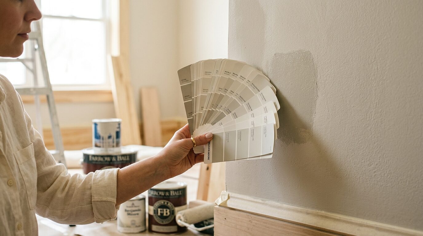
Always test paint on the actual wall before committing. Buy two or three sample pots, apply 30 × 30 cm patches directly on the wall you’re painting, and observe them across different times of day. A color that looks soft and warm at the paint store under fluorescent lighting can read gray and cold in your north-facing bedroom. No color chip, phone photo, or monitor screen accurately predicts how paint behaves in your specific room with your specific light.
This is not a styling guide about trending colors. It is a practical process for selecting paint that works.
Start With the Light, Not the Color
The single most important variable in paint selection is how your room receives light. Natural light changes throughout the day. Artificial light adds its own color cast. Paint reflects and absorbs both.
North-Facing Rooms
North-facing rooms receive indirect, cooler light throughout the day. Cool whites look flat and sterile. True grays can feel oppressive. Blues shift toward the cold end of their range.
What works in north-facing rooms:
- Warm whites with yellow undertones (Benjamin Moore White Dove OC-17, Sherwin-Williams Creamy SW 7012)
- Warm greiges (beige-gray hybrids like Accessible Beige SW 7036)
- Warmer neutrals: sage green, terracotta, warm taupe
- Deeper colors with red or brown undertones that add warmth
What to avoid: Cool whites, true grays, stark whites. These read as even colder in north light.
South-Facing Rooms
South-facing rooms receive warm, direct sunlight for most of the day. Colors look more saturated, more vibrant. Warm tones can feel overwhelming by afternoon.
What works in south-facing rooms:
- Cool whites and bright whites (Chantilly Lace OC-65, Pure White SW 7005)
- Soft blues and blue-greens
- Cool grays
- Pastel tones that would wash out in other orientations
What to avoid: Saturated warm tones in rooms with full south exposure - they can feel overwhelming in afternoon light.
East-Facing Rooms
East rooms get warm morning light and cool afternoon shadow. Colors shift significantly throughout the day.
Best approach: Choose a neutral that reads well in both warm and cool light. Greiges, soft whites with minimal undertones, and warm taupes handle the range well.
West-Facing Rooms
West rooms get cool mornings and warm, golden afternoon and evening light. They’re often the best-lit rooms in the house by late afternoon.
Best approach: Similar to south-facing rooms. Cool tones work well here, as the warm evening light adds the warmth for you.
Understanding Undertones
Every paint color has an undertone - a secondary hue that becomes visible as light and shadow interact with the paint. Undertones are what cause a “gray” to look purple in one room and blue in another.
The most common undertone surprises:
| Painted Color | Hidden Undertone | What It Looks Like When It Shows |
|---|---|---|
| Gray | Purple or blue | Looks lavender or slate in cooler light |
| White | Yellow or pink | Reads as cream or blush in warm light |
| Beige | Green or pink | Clashes with warm wood or warm furniture |
| Navy | Purple | Feels more purple than navy in dim light |
| Sage green | Yellow | Reads more olive or yellow-green in south light |
How to identify undertones: Hold the paint chip against a pure white card. The secondary color becomes visible against the neutral reference. Alternatively, view the chip against a piece of furniture or flooring it must work alongside.
The Testing Process
Step 1: Identify Your Candidates
Narrow to three colors. Not ten, not six. Three. Decision fatigue will drive you to pick randomly after the fourth option. If you genuinely cannot narrow below five, you have not defined what you want from the room yet. Revisit the purpose, the mood, and the fixed elements (flooring, furniture, trim).
Step 2: Buy Sample Pots
Sample pots are approximately $5–8 each. They cover about 0.5–1 sq ft each. This is not a place to save money. Painting an entire room and hating the color costs you a weekend and $80 in paint. Buying samples costs $15 and saves all of that.
Step 3: Apply Large Test Patches
Apply each sample color in a 30 × 30 cm (12 × 12 in) patch. Apply two coats - one coat never represents the final look accurately. Test in multiple locations in the same room:
- On the wall that receives the most direct light
- On the wall that receives the least light (usually an interior wall)
- Adjacent to the trim color if changing trim is not in scope
Step 4: Observe at Different Times
Check the patches at:
- Morning light (7–9 am)
- Midday (12–2 pm)
- Late afternoon (4–6 pm)
- Evening with your artificial lighting on
This is the step most people skip. A paint that looks perfect at 11 am on a Saturday - when you bought the sample and slapped it on - may look completely wrong at 7 pm on a weekday when you actually live in the room.
Step 5: Decide With Context
Look at the test patches while the room is set up as it normally is: furniture in place, usual lighting on. Do not evaluate an empty, brightly lit room if you live with a large sofa and warm lamps. The context matters.
Room-Specific Guidance
Living Room
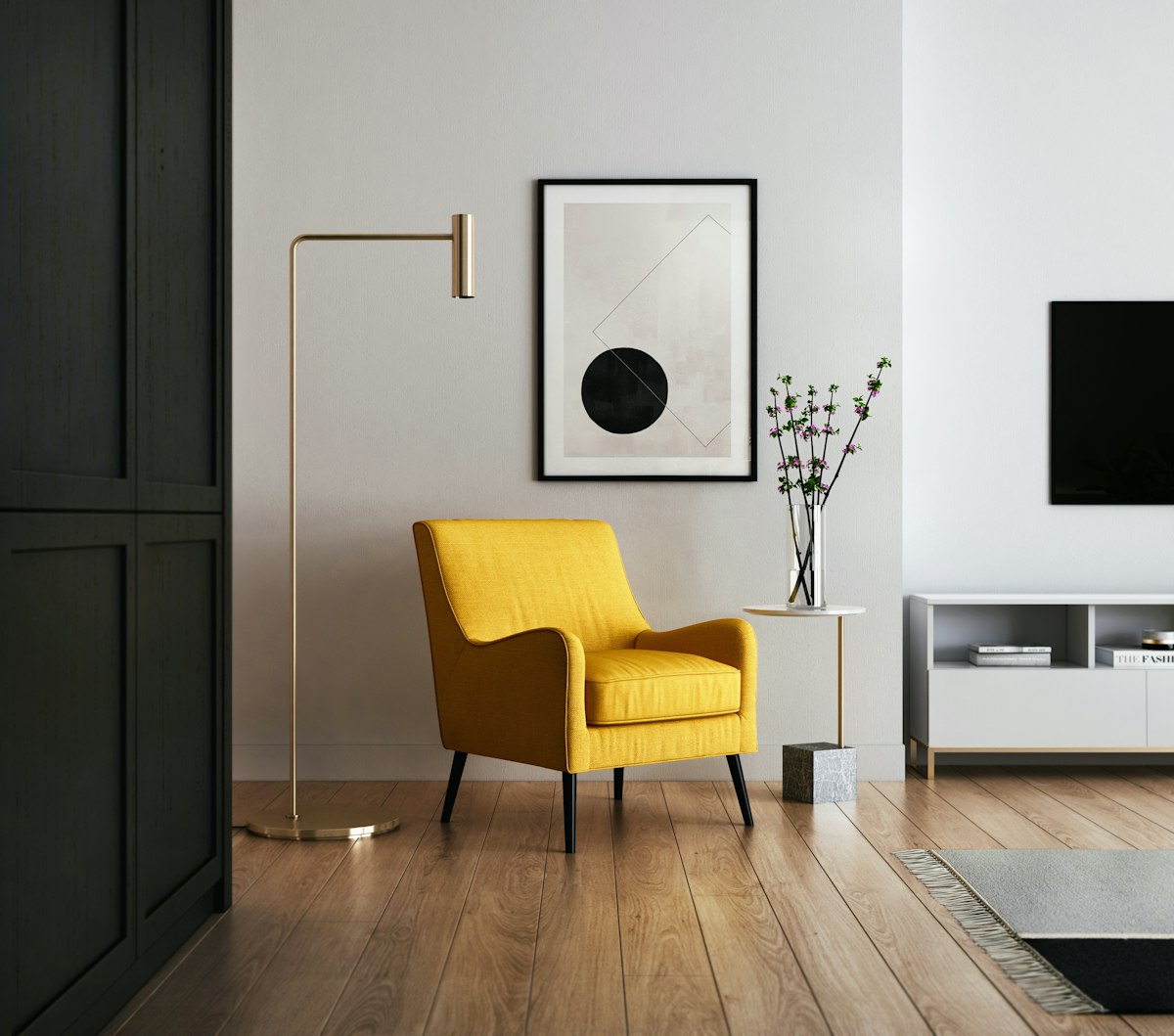
The living room carries the most weight because it is the most visible room in the home and the one where the most fixed elements - sofa, flooring, curtains - must coordinate.
The safest approach: Choose a color that responds to the largest fixed element in the room. If you have a gray sofa, a warm white with slight yellow undertone reads warmer and more inviting than a competing cool gray. If you have warm walnut flooring, a cool sage or dusty blue creates contrast without clashing.
Colors that work across most living room styles: Benjamin Moore Pale Oak OC-20 (warm greige), Farrow & Ball Elephant’s Breath (warm mid-gray), Sherwin-Williams Sea Salt SW 6204 (soft blue-green).
For a full approach to creating a cohesive living room, see our guide to cozy minimalist living room design.
Bedroom
Bedrooms favor colors that support rest. High-saturation, energizing colors - bright yellows, oranges, vivid reds - make sleep harder by stimulating the nervous system. This is not aesthetic opinion; it is how the visual cortex responds to color.
Best bedroom palette: Soft neutrals, dusty blues, muted greens, warm taupes, lavenders. Avoid anything with a high LRV (light reflectance value) above 75 if you want the room to feel enclosed and calm at night.
Specific recommendations:
- Dusty blue: Benjamin Moore Hale Navy HC-154 for dark and cocoon-like; Sherwin-Williams Rainwashed SW 6211 for soft and airy
- Warm neutral: Accessible Beige SW 7036, Edgecomb Gray HC-173
- Muted green: Sherwin-Williams Sage SW 2860, Benjamin Moore Pale Avocado 2146-40
For more on creating a restful bedroom, see how to create a sleep sanctuary.
Kitchen
Kitchens benefit from colors that make food look appetizing. Warm whites, soft yellows, and sage greens do this well. Cool grays and blues can make food look less vibrant - not disastrously, but noticeably when you compare.
The white kitchen caveat: A pure, stark white - Zero VOC Bright White, for example - reads clinical in kitchens with cool light. Add some warmth with a white that has slight cream or yellow undertone. Swiss Coffee, White Dove, and Antique White all walk this line correctly.
Cabinet color is a separate decision from wall color. White or off-white walls with a colored island or lower cabinets lets you introduce personality without committing the entire room.
Bathroom
Small bathrooms amplify color decisions because the walls are closer to you and closer to each other. A color that reads as subtle in a living room at 20 feet becomes dominant in an 8 × 6 ft bathroom.
For small bathrooms: Lean into light. Whites, very pale blues, very pale greens. LRV above 70 to keep the space from shrinking.
For larger bathrooms: More flexibility. Deep teal, moody navy, forest green, and dark charcoal all work in larger bathrooms with adequate lighting. These colors photograph beautifully and feel spa-like in person.
Moisture matters: Use paint specifically formulated for bathrooms (Benjamin Moore Aura Bath & Spa, Sherwin-Williams Emerald Interior Acrylic). Standard interior paint fails prematurely in high-humidity environments. See how to create a spa bathroom on a budget for the full bathroom refresh approach.
Home Office
Home offices sit at an intersection of functionality and mood. Too dark and the space feels closed and fatiguing during long work sessions. Too bright and you fight glare.
Best home office colors: Soft sage green (reduces eye strain), warm gray (neutral focus), muted blue (associated with productivity in color psychology research). Avoid pure white - it maximizes glare on screens.
For a complete workspace setup guide, see how to set up an ergonomic home office.
Paint Finish Guide
The finish affects how a color reads and how the surface performs. Higher sheen = more light reflection = color appears slightly lighter and more saturated.
| Finish | Sheen | Best For | Notes |
|---|---|---|---|
| Flat/Matte | None | Ceilings, low-traffic walls | Hides imperfections; marks easily |
| Eggshell | Low | Living rooms, bedrooms | Most versatile; slight washability |
| Satin | Medium | Kitchens, bathrooms, kids’ rooms | Cleanable; shows brush strokes more |
| Semi-gloss | High | Trim, doors, cabinets | Very washable; highlights every imperfection |
| Gloss | Very high | Accents, furniture | Highly durable; unforgiving surface |
The standard approach: Eggshell on walls, semi-gloss on trim and doors. This combination is correct for 90% of home painting projects.
What to Avoid
Choosing based on a phone photo. Camera phones auto-correct white balance, meaning every photo of a paint chip looks different from the original. Your phone is lying to you. Test on the wall.
Testing on a small chip. The larger the surface, the stronger the color reads. A 2 × 4 cm chip will always look lighter and less saturated than a painted wall. Sample pots exist for this reason.
Matching paint to upholstery exactly. An exact match between wall and sofa fabric creates a flat, one-dimensional look. Complement, do not match.
Forgetting the ceiling. Most ceilings are painted in a standard flat white. This is correct. Do not deviate from ceiling white unless you are deliberately creating a dramatic effect (dark ceilings in a tall room, color-drenching in a small room). A ceiling in the same color as the walls makes a room feel smaller and can feel oppressive. A slightly lighter shade of the wall color - pulling the LRV up by about 10 points - is the one exception that works consistently.