Most lighting decisions are made in hardware stores under fluorescent lights, which is approximately the worst possible context for evaluating how a bulb will behave in your home. The result is that most homes have a collection of bulbs that were purchased opportunistically and were never evaluated as a system.
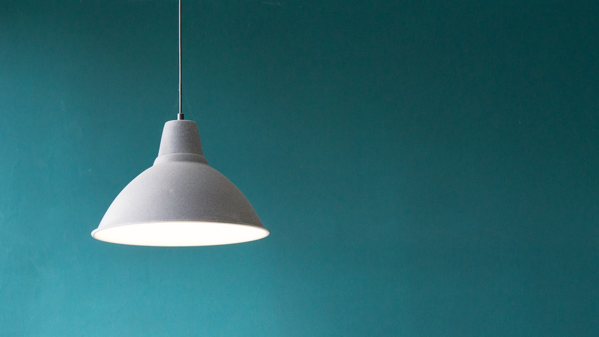
Color temperature is the single most impactful specification you can understand about a light source. It determines whether your living room feels like a mountain lodge in winter or a hospital waiting room. The number is printed on every bulb package. Most people do not know what it means.
What Kelvin Is
Color temperature is measured in Kelvin (K), the unit of absolute temperature. This is counterintuitive. Physically, lower Kelvin temperatures correspond to warmer (more orange or red) light, and higher Kelvin temperatures correspond to cooler (more blue or white) light. This is because a heated object, as it gets hotter, shifts in color from red to orange to yellow to white to blue-white.
The scale used in residential lighting runs from roughly 2200K to 6500K.
| Color Temperature | Color Appearance | Association |
|---|---|---|
| 1800-2200K | Amber-orange | Candlelight, fire |
| 2700K | Warm white | Traditional incandescent |
| 3000K | Soft white | Halogen, warm-white LED |
| 3500K | Neutral white | Transition zone |
| 4000K | Cool white | Office standard, kitchen |
| 5000K | Daylight | Overcast sky |
| 5500-6500K | Cool daylight | Midday sun, studio |
2700K is the standard that matters most in residential design. Traditional incandescent bulbs burned at approximately 2700K. The warmth of incandescent light that people remember fondly, and that LED manufacturers spent a decade trying to replicate, is a 2700K color appearance. When designers specify “warm white” they mean 2700K.
The Physics Behind the Perception
Why does color temperature affect how a room feels? The answer involves both physics and biology.
Light at different color temperatures affects how we perceive surfaces, colors, and even time. Warm light (2700K to 3000K) enhances warm colors in a room: wood tones, terra-cotta, warm neutrals, skin. It makes these surfaces look richer. It suppresses cool colors, making blues and greys slightly less vivid.
Cool light (4000K to 6500K) does the reverse. It enhances cool colors and makes spaces feel crisper, more alert, and more clinical. The same oak floor that looks warm honey under 2700K lighting looks grey-beige under 5000K lighting. The same room, same surfaces, different perception.
This is why lighting choices must be made in the actual space, or at least with a clear specification in mind, not guessed at from a package.
CRI: The Specification Most People Ignore
Color Rendering Index (CRI) measures how accurately a light source renders colors compared to a reference source (sunlight at the same color temperature). The scale runs from 0 to 100. Higher is better.
| CRI Range | Color Rendering | Applications |
|---|---|---|
| 60-75 | Poor | Industrial, warehouse |
| 75-85 | Adequate | Basic commercial |
| 85-90 | Good | Most residential |
| 90-95 | Excellent | High-quality residential, retail |
| 95-100 | Museum-quality | Art display, medical |
The practical significance of CRI: a bulb with low CRI (under 80) makes colors look slightly wrong. The red in a painting looks slightly brownish. The green of a plant looks slightly grey. The effect is subtle but cumulative. A room lit with 80 CRI bulbs does not look wrong; it looks slightly muted and less alive. The same room lit with 95 CRI bulbs looks vivid and accurate.
For most residential applications, CRI 90 or above is the threshold worth spending slightly more for. Below this, the degradation is noticeable if you compare side by side. Above 95 CRI, the improvement is increasingly subtle for general home use.
An important caveat: CRI is an averaged measurement across eight standardized test colors. It does not capture the rendering of all colors, particularly reds and skin tones. Some manufacturers report R9 (deep red rendering) separately, which is a useful supplementary specification. High-quality LEDs targeting good skin-tone rendering will have both CRI 90+ and R9 above 50.
Circadian Impact: Light as Biology
The effect of light color temperature on the human body is not merely aesthetic. It is physiological.
Blue wavelengths of light (which are more prevalent in high-Kelvin cool light) suppress melatonin production. Melatonin is the hormone that signals the body to prepare for sleep. Exposure to cool, blue-rich light in the evening suppresses melatonin and delays sleep onset. This is well-documented in sleep science literature.
This is why the advice to avoid screens before bed is specifically about the blue-rich light of screens, which typically output light equivalent to 5000K or higher. The same concern applies to cool LED lighting in bedrooms and living spaces used in the evening.
Warm light (2700K) has significantly less blue content than cool light (4000K and above). For spaces used in the evening, particularly bedrooms and living rooms, 2700K is not merely aesthetically preferable. It is biologically appropriate.
Some premium LED systems offer tunable white: the ability to shift color temperature across a range (from 2700K in the evening to 5000K during the day) to support the natural circadian cycle. These systems represent a meaningful upgrade over static color temperature LEDs, particularly for people who spend long periods under artificial light.
Room-by-Room Specifications
Living Room
Recommendation: 2700K, CRI 90+
The living room is used primarily in the evening and needs to feel relaxed and warm. 2700K is the correct specification for all sources in the living room: the ambient fixture, table lamps, floor lamps, and accent sources. Consistency within the space matters. A 2700K pendant paired with 4000K table lamps creates a visible and unpleasant contrast.
If you want to read comfortably in the living room, the answer is not a cooler bulb. It is a task lamp positioned close to the reading surface with a warm but sufficiently bright bulb. A 2700K, 800-lumen (equivalent to a 60W incandescent) table lamp at close range provides excellent reading light without shifting the room’s color temperature.
Bedroom
Recommendation: 2700K or lower (2200K for bedside), CRI 90+
The bedroom is the most important space to maintain warm color temperature, particularly for sources that are on in the evening. The ceiling fixture can be 2700K. Bedside lamps, used just before sleep, benefit from being even warmer: 2200K to 2700K. Some dedicated bedside bulbs are designed to maximize warmth and minimize blue content.
Avoid 3000K and above in bedrooms entirely. Even 3000K, while still considered “warm” by many product descriptions, has more blue content than 2700K and is meaningfully cooler in a bedroom context.
Kitchen
Recommendation: 3000K to 3500K, CRI 90+
The kitchen requires more light and better color accuracy for food preparation than living spaces. 3000K is the ideal compromise: warm enough to feel residential rather than institutional, cool enough to see food colors accurately.
For task lighting specifically (over the cooktop, under cabinets above prep surfaces), 3500K is acceptable and preferred by some cooks who want more precise color discrimination.
Avoid 2700K in kitchens. It makes food colors ambiguous and the space feel dim even at adequate lumen levels. Avoid 4000K and above; it makes the kitchen feel clinical.
Bathroom
Recommendation: 3000K, CRI 95+
The bathroom presents a direct conflict between atmospheric and practical requirements. You want the bathroom to feel calm and warm. You also need to see skin color accurately for grooming and health assessment.
CRI becomes more important in the bathroom than anywhere else. Makeup applied under poor CRI lighting looks wrong in natural light. For the mirror area specifically, CRI 95+ is genuinely worth the premium.
3000K is the right balance. Warm enough to be pleasant, neutral enough for accurate color assessment. The same specification should apply to the task lighting at the mirror and the ambient lighting for the space.
Workspace / Home Office
Recommendation: 3500K to 4000K, CRI 90+
The workspace has different biological requirements from the rest of the home. Alertness, focus, and visual acuity are prioritized over atmosphere and circadian wind-down.
4000K is the professional office standard because it supports alertness and provides accurate color rendering without being as blue-heavy as 5000K. For home offices used in the morning and early afternoon, 4000K is appropriate.
For those who work in the evening, the tradeoff is real: cooler light supports alertness but disrupts sleep. If evening work is unavoidable, 3500K is the best compromise: slightly cooler than living space temperatures, but not so blue-rich as to cause significant melatonin suppression.
Dining Room
Recommendation: 2700K, CRI 90+
The dining room follows the living room specification. 2700K for all sources, dimmed in the evening for the pendant, supplemented by ambient sources. Warm light makes food look appealing. Cool light does not. This is not subjective: food photographs look better under warm light, and food looks better to the eye under warm light. Restaurant lighting designers know this.
Mixing Color Temperatures: The Rules
Within a single visible space, do not mix color temperatures. The contrast between a 2700K lamp and a 4000K recessed light in the same room is immediately obvious and never looks intentional.
Across zones, color temperature transitions are acceptable. A 3000K kitchen adjacent to a 2700K living room reads as a transition between functional and relaxed. This is not jarring because the zones are distinct.
The one acceptable exception: a single accent source can be slightly cooler than the ambient to highlight an object. A 3000K accent light directed at a piece of art in a 2700K room creates a subtle effect that reads as visual focus. Going beyond this, or using cool accent sources for general lighting, creates incoherence.
LED Specifications: What to Read on the Package
When purchasing LED bulbs, the meaningful specifications to check:
| Specification | What to Look For | Why It Matters |
|---|---|---|
| Color Temperature | Printed as “2700K” or “Warm White” | Determines warmth |
| CRI | Look for ≥90, usually says “CRI 90+“ | Determines color accuracy |
| Lumens | Not watts. 800lm ≈ 60W incandescent | Actual light output |
| Dimmability | ”Dimmable” on the package | Required for dimmer circuits |
| Beam Angle | Degrees (e.g., 30° narrow, 100° wide) | Determines light spread |
Watts are a measure of energy consumption, not light output. An LED bulb consumes far less energy than an incandescent at the same lumen output. The lumen specification is what to compare. As a rough conversion:
- 450 lumens is approximately equivalent to a 40W incandescent
- 800 lumens is approximately equivalent to a 60W incandescent
- 1100 lumens is approximately equivalent to a 75W incandescent
- 1600 lumens is approximately equivalent to a 100W incandescent
The Practical Audit
If your home currently has a mix of color temperatures and you want to resolve it:
Step one: note what is currently installed in each fixture (color temperature is on the base of most LED bulbs). Identify the inconsistencies.
Step two: decide the target temperature for each room (use the room-by-room guide above as a starting point).
Step three: replace inconsistent bulbs. This does not need to happen at once. As bulbs reach the end of life, replace them with the correct specification. Proactively replace any bulbs that are significantly wrong for their space.
Step four: purchase one or two of the target bulbs and live with them before replacing an entire set. Actual installed appearance is the only reliable test.
The Bottom Line
2700K for living rooms, dining rooms, and bedrooms. 3000K for kitchens and bathrooms. 3500K to 4000K for workspaces. CRI 90 or above everywhere. Dimmability on any circuit that has a dimmer or might someday have one.
Do not mix color temperatures within a single visible space. Do not buy bulbs by wattage. Do not trust how a bulb looks in the hardware store.
The difference between a room lit with the wrong color temperature and the right one is not subtle. Get this right before you buy new furniture, repaint walls, or invest in new fixtures. It costs less and changes more than almost any other single decision in a room.


